
To say there’s some overlap between iOS and Android is an understatement. Google scrapped its original mobile OS concept and pivoted to a touch-based mobile operating system only after Steve Jobs showed off the iPhone, and has been borrowing features from Apple for years ever since—shamelessly taking things like Siri, Do Not Disturb, and Touch ID and giving them the Android treatment.
Of course, Apple is by no means blameless when it comes to pilfering from the other side. Third-party keyboards, widgets, and the Control Panel were all popular Android features before they were borrowed and adapted for iOS. Much like the Windows-Mac wars, each side seems to have an understanding that the march toward a perfect OS requires a little give and take.
The last Android release, which surprisingly landed in developer’s hands earlier this month, is no exception. But this time around, it’s less about features than it is about how they’re implemented. iOS 9 was about refining the experience, and it looks like Google’s taking a similar path with Android N—while much of what’s new is already baked into key components of iOS, Google has brought some impressive ideas to the table, reimagining and elevating some of Apple’s best features in clever and unique ways. And I hope Apple steals a few of them back.
Window shopping
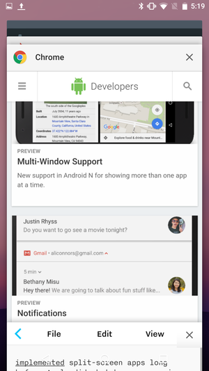
Galaxy users will argue that Samsung implemented split-screen apps long before Apple did, but by no means is iOS 9’s Split View a “me, too” feature. Elegantly executed with careful precision, side-by-side apps in iOS 9 brought mobile multitasking on the iPad to the next level, finally bringing the productivity and focus users have been clamoring for. It’s a great feature, both in TouchWiz and iOS, and it’s no surprise that Google is bringing it to Android proper.

Android N’s multi-window mode, side-by-side.
But while Apple used Split View as a way to separate the iPad from the iPhone, Google is bringing multi-window support to all N-ready devices big and small. In portrait mode, the apps are positioned one above the other—something that Apple doesn’t even support on the iPad—and even without many optimized apps yet, it’s actually quite useful. I probably wouldn’t use it as much as I do on my iPad, but sharing data between two apps on my iPhone without jumping back and forth through the multitasking carousel would be a great addition to Split View in iOS 10.
The dark side

I love Android N’s dark mode, which is part of Night Mode.
Apple didn’t really beat Google to the color-warming punch—Night Mode was a feature in the Android M beta that didn’t make it to Marshmallow—but iOS 9.3’s Night Shift technically brought the feature to iOS first. But no matter who gets the first-place crown, the temperature-adjusting trend started by Mac and iOS app f.lux is about to hit the mainstream, and screens on both sides of the aisle are about to get a lot easier on the eyes.
On iOS, Apple’s implementation is fairly straightforward. A toggle turns on blue-light reduction and a slider adjusts how yellow your screen will appear. Additionally, you can set a schedule for what time the color will change each day or turn it on manually using a new button in the Control Center.
Android N does things a little differently, applying reset filters to adjust the tint and brightness. Rather than utilize a schedule like Night Shift, Android will switch on Night Mode automatically if you desire, based on your location and time of day. But the part I want Apple to borrow is the dark theme, which turns all the white bits of Android black when Night Mode switches on.
Picture this
Picture in Picture was one of the most surprising features in iOS 9, bringing a taste of real OS X-style multitasking to the iPad. If you’re watching a video or making a FaceTime call, you can still write an email or surf the web, shrinking the video screen to a small floating window that can be moved anywhere on the screen.
Android N’s version is a bit different. Instead of designing the feature for tablets or smartphones, the beta version of Google’s own PIP window is limited to Android TV, where you can use other apps without interrupting your movie. Back in the 80s, PIP was a big deal on our TVs, and Android just might be onto something here.
Nap time

Android N’s Doze is a major battery saver.
Until the batteries in our phones can charge themselves kinetically or become big enough to comfortably last a full day, each new OS version is going to include ways to squeeze every last bit of juice out of the ones we have. iOS 9’s Low Power Mode sacrifices performance for battery life, turning off things like background app refresh and Hey Siri when it’s activated (usually when the battery drops below below 20 percent).
Android introduced its own battery-saving feature in Marshmallow called Doze, but unlike Apple’s version, you don’t need to turn it on. Instead of limiting the things your phone does, Doze kicks in when your phone is idle and stationary, supercharging standby mode but not doing too much to help throughout your day. In Android N, Doze activates anytime the screen is turned off, even when it’s in your pocket. I’m sure Apple is already working on better battery-saving features to unveil at WWDC, and this is one I wouldn’t mind seeing make its way into iOS 10.
Quick take

Settings, as seen in Android N.
The way Apple and Google approach quick settings are about as opposite as you can get: In Marshmallow, you need to swipe down from the top of the screen; in iOS, the Control Center is accessed by swiping up from the bottom. But while you may assume Android’s quick settings can be customized to your heart’s content, that’s not really the case—users needed to access the hidden System UI setting if they want edit the icons that are visible.
But Google has taken a page from iOS in version N. A single swipe down immediately reveals a set of five icons, and if you swipe a second time you’ll be able to edit the ones that appear as favorites. It’s a neat feature that I’d love to see in the Control Center (honestly, I can’t remember the last time I used the Bluetooth toggle), but that’s not what piqued my interest the most. Google has also opened up its quick settings API to developers, allowing for third-party shortcuts to be added to the menu. Apple has shown a willingness for button customization with Apple Watch’s complication and 3D Touch’s quick actions, and I’d love to see developers can do with the keys to the Control Center.
Back in time
Android’s N multitasking button is much welcome.
Ever since we’ve been using our phones for more than text messages and calls, there’s been a struggle to quickly switch between apps—specifically the one we were just using. Beyond the handy card-filled carousels, both Apple and Google have developed shortcuts in the way of back buttons; Android’s permanent button below the screen goes back one step (which may or may not actually return to the last used app) while iOS 9 introduced the handy “back to” button that appears in the status bar).
Google apparently took notice of Apple’s more practical method and has replicated the quick return in Android N. But instead of only appearing when needed, Google baked the functionality right into the existing multitasking button; when you double tap the square icon below the screen, you’ll instantly be sent back to the last app you were using, even if you’re on the home screen. Apple has always been ahead of the curve when it comes to mobile navigation, but this is one feature that would make a world of difference on iOS, especially if you’ve ever tried to hit the “back to” button with your thumb.
Are there any Android features you’d like to see Apple bring to iOS? Let us know in the comments below.
Author: Michael Simon, Executive Editor

Michael Simon has been covering Apple since the iPod was the iWalk. His obsession with technology goes back to his first PC—the IBM Thinkpad with the lift-up keyboard for swapping out the drive. He's still waiting for that to come back in style tbh.